Roku
Product Designer
2025 – Present
Launching a new checkout experience at Roku
Modernizing checkout into a faster, simpler, future-ready conversion funnel
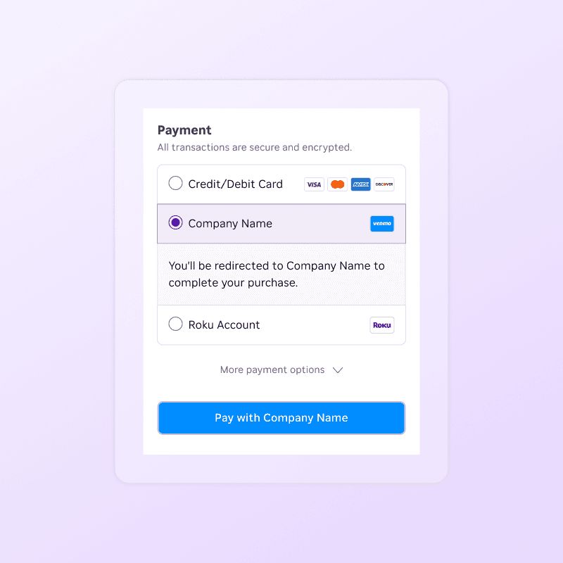
Designing a simpler, more trustworthy checkout system for Roku web.
Roku’s device checkout had become fragmented and confusing after years of layered promos, accessories, and shipping rules, leading to significant cart abandonment and a poor mobile experience.
I led an end‑to‑end redesign focused on improving both cart completion and mobile optimization while clarifying pricing and taxes and aligning the UI with Roku’s design system. The new experience uses modular components so teams can merchandise devices and bundles without breaking consistency.
Approach: Treat checkout as a modular single page system
I audited all existing device checkout variants, then used funnel data and support insights to pinpoint friction in product selection, address entry, and payment. From there, I defined a mobile‑first four‑step flow and a reusable component library that could flex across devices, promos, and regions. I partnered with Product, Engineering, Research, and Legal to align constraints and implementation details.
The redesigned checkout emphasizes clarity: product tiles clearly show price, options, and savings; shipping and tax estimates are surfaced earlier; and a concise review step summarizes everything before purchase.
Internally, a modular system lets teams adjust merchandising, promos, and messaging within safe constraints instead of rebuilding layouts. Post‑launch, we saw higher completion and fewer support issues related to order details, and the patterns are now reused in other commerce flows.


This work reinforced that checkout is where UX, brand, and revenue intersect, and that clear communication can be a powerful growth lever. Treating the flow as a system of components (not a static page) gave Roku more flexibility to evolve plans and promotions without sacrificing user trust.